Heuristic evaluation and its impact on user experience

Written by: Sarah Romeo, Senior Digital Designer

Even if you don’t work in the world of design, you may have heard the term user experience (UX.) Lately, there has been a lot of buzz about UX and how its practices can help build better websites, apps, branding, products, and more.
While growing in popularity, UX testing is often ignored due to its extensiveness, cost, and time-consuming nature. But if this practice is neglected, you could end up with products that have usability issues, leading to user frustration and drop-off.
What is Heuristic Evaluation?
A heuristic evaluation is a usability engineering method used to identify the usability problems in a user interface (UI), making it easier to address and solve these potential issues. Heuristic evaluations are usability inspections, where multiple usability experts analyze a user interface against an established set of usability principles (the “heuristics,”) to determine the usability of your product.
Simply put, a heuristic evaluation will test whether your product is user-friendly or not.
The most commonly used heuristics are Nielsen’s ten general principles. Developed by Jakob Nielsen and Rolf Molich, these ten principles are rules used by evaluators to determine the usability of a product. These principles are:
- Visibility of system status
- Match between system and the real world
- User control and freedom
- Consistency and standards
- Error prevention
- Recognition rather than recall
- Flexibility and efficiency of use
- Aesthetic and minimalist design
- Help users recognize, diagnose and recover from errors
- Help and documentation
While these are the principles most frequently used in heuristic evaluations, they are not the only heuristics to consider. Gerhardt-Powals’ cognitive engineering principles, and Weinschenk and Barker’s classifications are also commonly used during evaluations, among several others.
It is also useful to note that depending on the project, heuristic sets can be mixed and matched to best suit the evaluative needs at hand.
Heuristics In Real Life
Believe it or not, you probably encounter usability issues in products more than you realize. You may have landed on a site and thought, “Wow, this is so easy to use!” or maybe you’ve come across a product that incites frustration because the system didn’t function how you expected it to. In either case, the heuristics apply to your interaction with the product.
Here are some more in-depth explanations of some heuristics and how the user experience can be impacted when they’re not followed:
Visibility of System Status
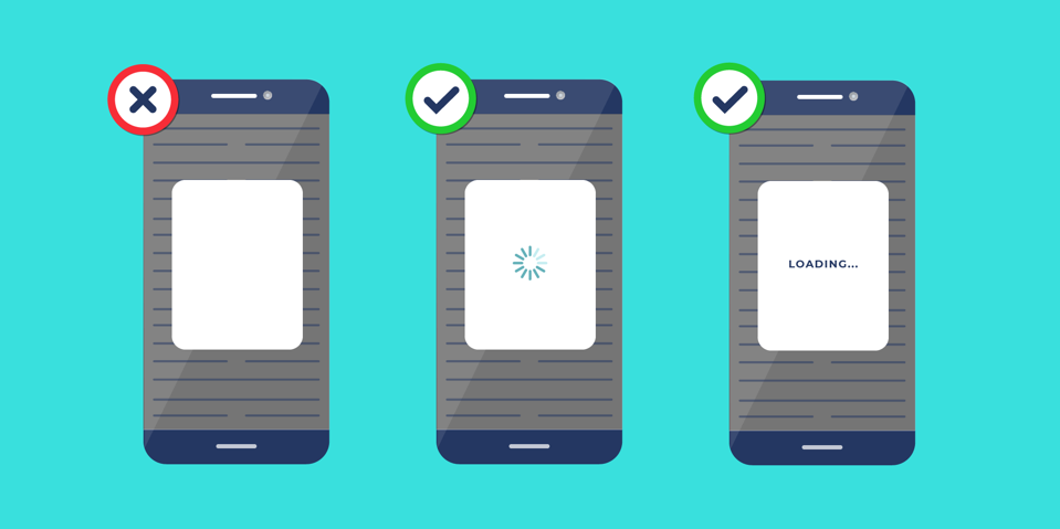
Definition: The system should always keep users informed about what is going on through appropriate feedback within a reasonable amount of time.
User Experience Impacted When Not Followed: A user may not understand if or why something is happening, leading to a lack of trust in your product and user frustration.
Real-Life Example: We’ve all heard the phrase “Communication is Key.” But communication is not only important between you and your significant other. Communication does wonders for a user’s interaction with your products as well.
Picture the user that constantly taps their phone while something loads. If there is no message conveying the system status, they will sit there irritated, jabbing their thumb into the screen or clicking their mouse until the page loads or even worse; they may leave your page altogether.
However, by simply keeping your user informed of the status of their task, you reduce user frustration by informing the user that the system is working. Providing them with an animated wheel, progress bar, or simply stating “LOADING” on a page will communicate to the user exactly where they are in the process.
Consistency and Standards
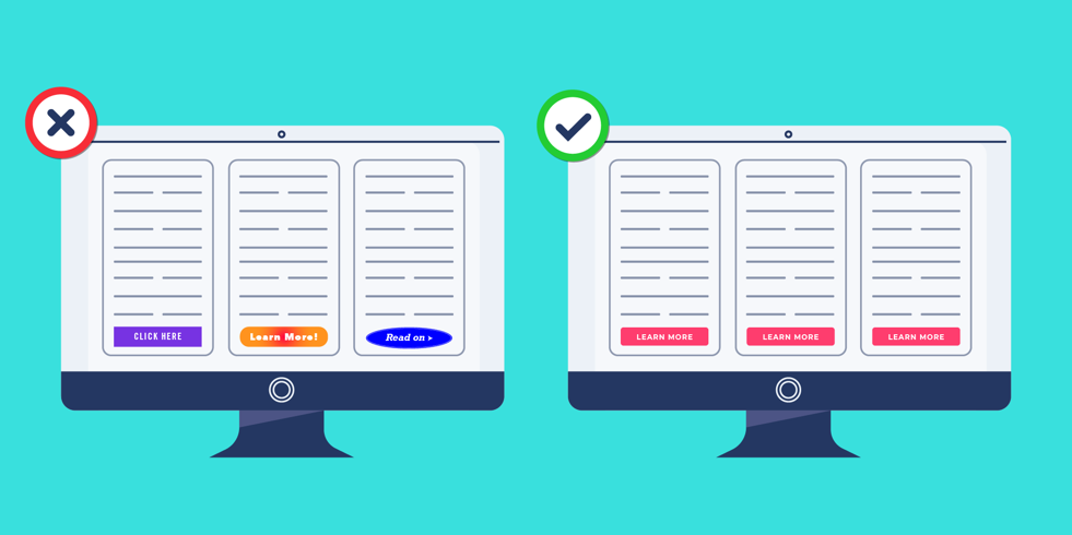
Definition: Users should not have to wonder whether different words, situations, or actions mean the same thing.
User Experience Impacted When Not Followed: Your product may not be “learnable” for a user, in which case that user would have a hard time understanding how to navigate through your site.
Real-Life Example: Keeping your designs consistent not only gives a clean look and feel, but also makes it easier for your users to navigate and complete tasks. Consistency throughout your product does not require your users to learn new representations for each task, allowing users to navigate quickly and easily through your product. This can include having the same button colors and shapes throughout, typeface, treating all menus the same, and giving each page a cohesive look and layout.
Internal and external consistency are two major factors to consider. Internal consistency refers to maintaining consistency within your own product. One important element to consider is color throughout your product. For example, if you were to have a call-to-action button in a light blue color and in another area use a dark red for that same call-to-action, it goes against the user’s established meaning of that visual treatment.
Consider this statement pulled from Jakob’s Law: “People spend most of their time on websites other than yours.” External consistency is also extremely important to consider when designing your product. In addition to keeping consistent with your own design, consider the experiences your users encounter externally. By following typical functionality and design standards, your users will know how to interact with your website from previous experiences and are less likely to become confused or frustrated by your product’s design.
Being consistent is imperative, and when done correctly, users are able to navigate and interact with your product, as well as external products with a sense of standardization. This lessens the chance of confusion or frustration from a user in your product.
Help Users Recognize, Diagnose and Recover from Errors

Definition: Error messages should be expressed in plain language (no codes), precisely indicate the problem, and constructively suggest a solution.
User Experience Impacted When Not Followed: Your product’s messaging can be unclear or difficult to decipher, leaving users unable to correct their errors easily.
Real-Life Example: Picture this, you are filling out an important form on a website, and something goes wrong. “ERROR” pops up on your screen. Nothing more, nothing less—just “ERROR.” Questions begin racing through your head: What happened? Did you do something wrong? Was your progress saved?
Confusion and frustration—the dynamic duo is describing how that scenario makes the user feel. But this can be avoided. Error messages can be frustrating, but by presenting them correctly, you can ensure that your user sees the message and knows where to go from there.
Helping your users recognize what went wrong and how to recover from their errors will give them the confidence to continue using your product.
This heuristic can be met by using the following tips:
- Ensure the error message happens in close proximity to where the error occurred so that the user knows where to search for the error.
- The error area needs to be conveyed in an appropriate color like red, showing the user something went wrong. Using a color like green would convey an action was completed correctly and could lead to confusion in your user. Note that it’s important to consider the visually impaired when choosing colors for error messages.
- Error message language must be written so anyone can understand it. Some error messages can use “techy” language, but the everyday person may not know what the message means. By giving clear direction to users, they can perform the correct action to repair the error.
How Do Heuristics Apply to User Experience?
User experience testing is important, but as mentioned before, it can be an extensive and pricey process. This is where heuristics come into play. By conducting these evaluations before user testing, you are more likely to catch common errors, making user testing a little less time consuming and costly. It is important to note that heuristic evaluations are NOT meant to take the place of user testing, but to work hand-in-hand with user testing to ensure your product is user-friendly and intuitive.
When conducting heuristic evaluations, it is highly recommended that you hire a professional. Qualified evaluators have special training allowing them to detect issues that novices are unlikely to identify. Having more than one skilled evaluator look over your product could also ensure more usability problems are found throughout the process.
Once completed, the evaluation’s results will be compiled for your review. You may choose to pass the collected feedback onto designers, who can then apply the corrections to your product for improved usability. They may choose to simply make the adjustments to your existing interface, or in some cases, they may have more success redesigning the entire user interface if the usability issues are very severe.
Final Thoughts
Heuristic evaluations assist in ensuring your products are user-friendly. These evaluations should not be used in place of user testing. However, they will assist in keeping the costs of user testing down by finding errors in your site before testing takes place.
Using these evaluations early on and frequently will result in a better end-product. Once the updates from a heuristic evaluation are in place on your site, this could be an ideal time to do an additional round of user testing to see how far your product has come, and the impact of these improvements. In conjunction with these evaluations, also consider including market research, user research, and data tracking for overall product improvement.


Contact Us
Urban Emu is an experience agency proudly driven by a singular mission: to transform the way humans live. We achieve this through a powerful fusion of design, technology, and communications, creating unparalleled online and offline experiences.
We love to hear about ideas big or small. Please don’t hesitate to get in touch with us regarding your project.
Email: hello@urbanemu.com
![]()

![]()

Stay updated on what’s new with our newsletter.
![]()
![]()
Contract Number: 47QTCA20D003Z